|
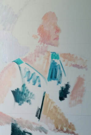
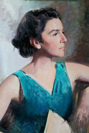
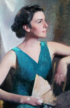
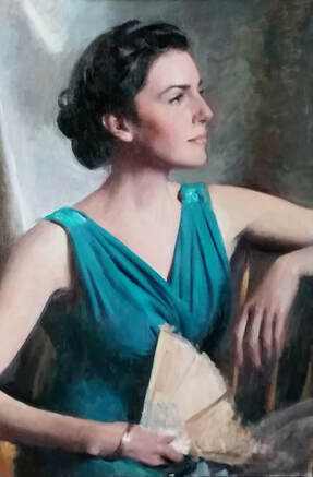
I'm very pleased to share with you one of my major projects from 2019: my first formal portrait in oil of my wife, Deirdre.  Oil on canvas. 30"x20" I set out with the cooperation of my gorgeous wife, Deirdre, to make a beautiful and elevated portrait of her. I have long wanted to attempt a portrait of my wife that was more than a quick pencil sketch (which I often have the pleasure of doing) and I'm very grateful that I was able to work on it this year. We set about gathering together three or four different outfits a few weeks before the sitting. I took these outfits in the studio to coordinate and harmonize them with different background draperies and other props that I had well before Deirdre came in for the photoshoot. With this previous preparation we were able to set about posing and snapping photos of Deirdre in the context of my studio's wonderful North light. (I actually had her come into the studio on her birthday!) During the process I would take dozens of photos, giving Deirdre some direction about her pose ranging from asking her to perform small actions like straightening her hair or setting out a fan to inspire or discover a pose that I had not yet imagined to asking her to tilt her head slightly one way or another to refine a pose that was already working very nicely. Every once in a while I would give Deirdre a break from posing and we would discuss the images that we had taken so far and she would be able to give me immediate feedback about what her favorites were. After about an hour and a half, 300 pictures, and various adjustments, we went back home to start the sorting and editing process. Some work in progress shots: After hours of sorting and editing I narrowed the source material down to four photos and let our Beauty Advocacy community help us decide on the final! (thank you!) Then the work of the final painting got started. As we went through the development of the painting it was fascinating to both Deirdre and myself how the image was transformed. A painted portrait from a photograph can never be an exact copy (which is a good thing). It will always be changed in some way through human eye and mind. It was remarkable to see how some slight shift in an eyebrow or the curve of the lips could bring about large changes in the tone and expression of the sitter and the feel of the painting altogether. I hope that the crafting of these nuances has brought about a deeper and truer image of Deirdre than the camera was able to capture; one that is in fact more reflective of her personality, warmth, and dignity.
One of the last adjustments to the image that we decided to make was to change Deirdre's earring from a large wooden one that was in the original photo to a smaller, gold, fan-shaped hearing that you see here. I made this decision for a number of reasons - the first reason was to elongate the feel of Deirdre neck to give a greater feeling of dignity and grace - I felt the large chunky wooden earrings took away too much from the vertical lines at this particular angle. After this I tried a vertical silver earring which we found made the picture overall feel too cold. Finally we decided on the earring that you see here and we're very happy with the warmth and interest it brought to the picture. 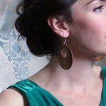  I'm also pleased with the way the wedge or triangle shape of the earring plays into and interacts with the other triangles in the composition. If you take a look you'll see a series of these shapes in Deirdre dress, made by the angles of her arms, her fingers, and of course the shape of the fan at the bottom of the painting. 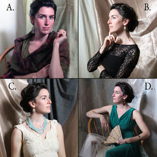 The original options that we submitted to you for a vote on which to choose - and you voted on D, my favorite! The fan is an antique one that Deirdre fell in love with at a thrift store when she a teen (and had a penchant for costumes and all things dramatic) and which her mother later gave to her as a gift. The bracelet she wears is also an antique and, although it's not visible to the viewer, is actually a Rosary bracelet so that it can be a sacramental companion to prayer. Hopefully the brightness of her face and some aspects of her character are complemented by these details. 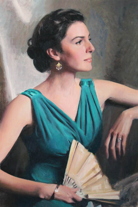 Currently untitled I am thoroughly delighted with this completed the painting and we hope you will be too!
Now I need your help again: what do you think should be the title?
13 Comments
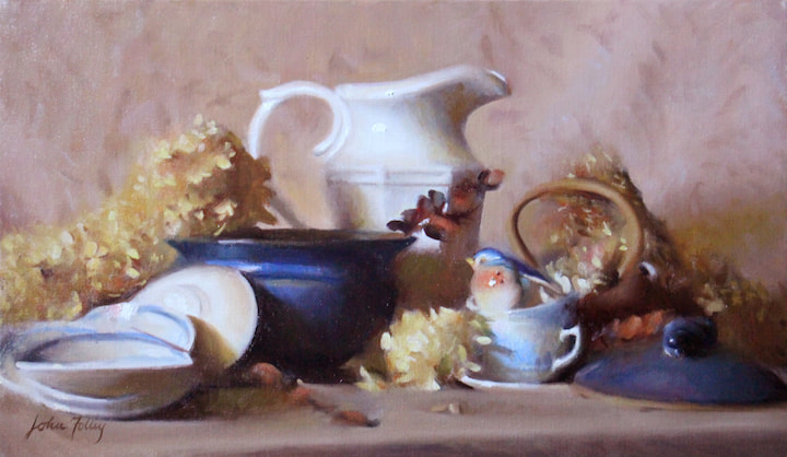 'Chesternest' Oil on canvas. 14" x 24" Chesternest is named after the apartment home where my wife Deirdre and I grew our family from one child to three. We called our apartment 'The Chesternest' because of its location in Manchester, NH as well as the fact that Deirdre was in 'nesting' mode when we moved in, as we were expecting our second child. Being on the second floor of a three-family home, we felt "nestled" into our spot above a street where we came to make many friends and share a beautiful season of our life. That home, which we left this past spring, was filled with happy memories including the more than three years of my drawing and painting training under Paul Ingbretson, many hours spent playing with our little ones, and hours of friendship and parties with other families from the neighborhood. It was our cozy nook for a young family in a small city. I hope this painting communicates some of that feeling. Among the elegant ceramics and delicate dried hydrangea blossoms, a small porcelain bluebird is making its nest inside a stacked teacup. The blue and red-browns and yellows that predominate this painting have an air of calm and quiet about them. They are subtle rather than loud. There is a sense of stillness and perhaps even distance about this still life that I hope will remind the viewer of the peace of a home. The blue china cups and plates that are stacked and scattered throughout the painting are actually from the set of dishes we used as a family on a daily basis for our meals, and are artifacts weighed down with the memories and happiness of those days for me. Information for collectors: Please see further details about Chesternest on the Still Life page.
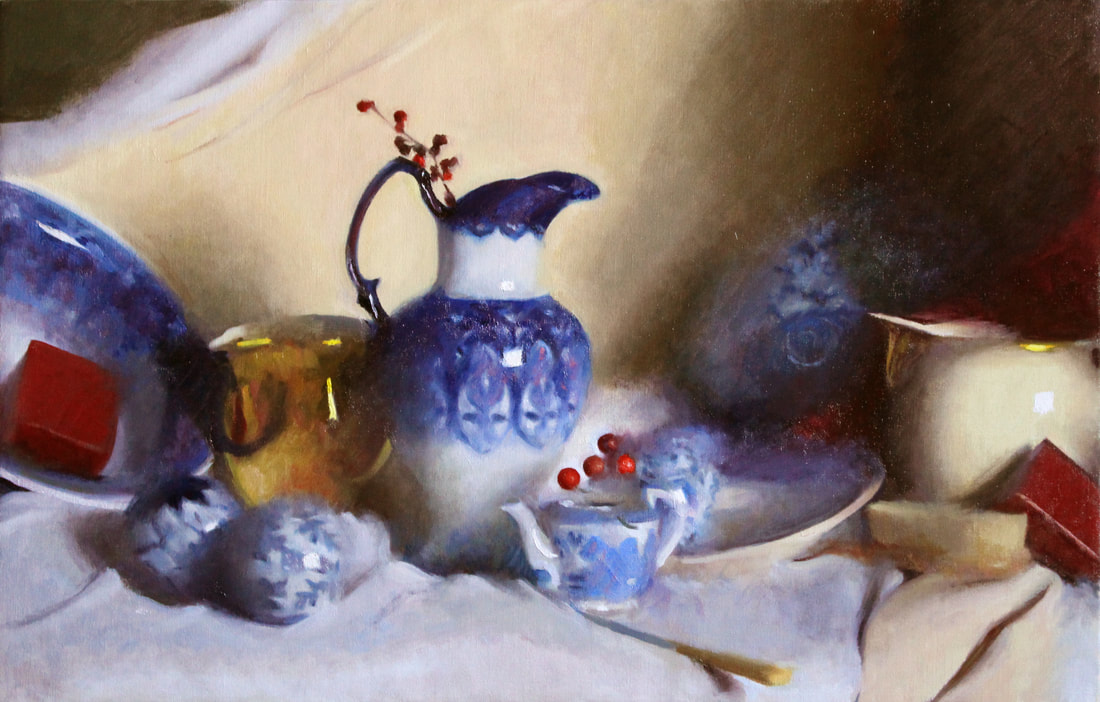 This painting began with a focus on the lovely designs, shapes, and colors of the blue porcelain pieces. I loved the icy, wintery feel the colors have and the ornate patterns reminded me both of the patterns ice and frost can make as well as the festive decorations surrounding the Christmas season. I loved playing with the balance of seeing these beautiful blue details and also letting them fade back and not be seen. I knew that I needed a great red to complement the blue but I was not so sure about a yellow and not decided about how much red to incorporate. I had tried a number of things in the studio but wasn't particularly excited about any of my solutions. Finally, I was out driving with my family on a cold day and I noticed a beautiful winter landscape that immediately called to mind my blue porcelain -- and behind it was a soft, bright yellow-pink-gray. At that moment I knew the the same yellow-pink-gray of that sky would complete my color scheme for this work and the painting developed from there. Here is the final product -- what evolved from 'Blue Porcelain' through 'A Wintery Landscape' ...to 'Blue Winter Porcelain.' This painting is now available to collectors. Please click here for more information and feel free to contact us to discuss a purchase. |
AuthorHello there, I'm John H. Folley, an oil painter in the Boston School tradition. Thanks for visiting the Beauty Advocacy Blog, where it's my job to help you become a more discerning art appreciator. 
Connect with John:
Categories
All
Archives
February 2024
|