|
This is the auction page! Please read the rules at the bottom of this post and leave your bids in the comments! Good luck! 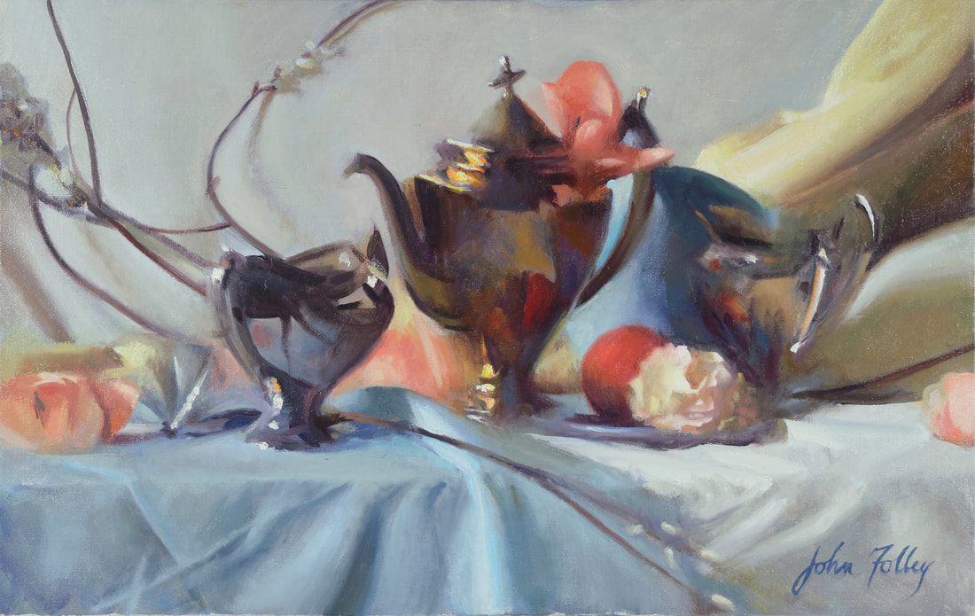 Dulcinea oil on canvas 14"x22"   Please read the auction rules here:
This auction will close tomorrow, Friday the 16th, at midnight!
7 Comments
Last summer I received a message via Instagram from a woman who comes from a family which, I have since gathered, takes gift-giving very seriously. Mary had a concept in mind for a Christmas gift painting for her mother and wanted me to execute it. It was my honor to do so and the result is Ex Calibur. 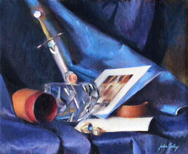 'Ex Calibur' oil on canvas (13" x 16") The driving meaning of this painting is the long and loving marriage of Mary's parents. Deirdre and I had the pleasure of visiting with Mary when she took a mini road trip to my studio in order to hand-deliver these objects which are of great sentimental value to her and her family, especially her mother. During that visit, she shared with us about the pieces and their significance. In the painting you see an unusual sculpture that consists of two parts: a cut Steuben glass orb (if you will) and a beautifully crafted sword. The glass represents the Stone of legend and the sword is Arthur's famous weapon, Ex Calibur. Mary explained to me that this sculpture is a treasured possession and meant a lot to her parents (her father has passed away). The couple had discovered it in a shop many, many years previous but it had been outside their budget, so they kept it in mind and saved up for it while raising a large and busy family. They finally purchased it as a celebration of their 50th wedding anniversary. To Mary, seeing it is a reminder of the virtue of patience -- not to be stressed when something takes time or has to be budgeted for, since her parents waited 50 years for this gift! 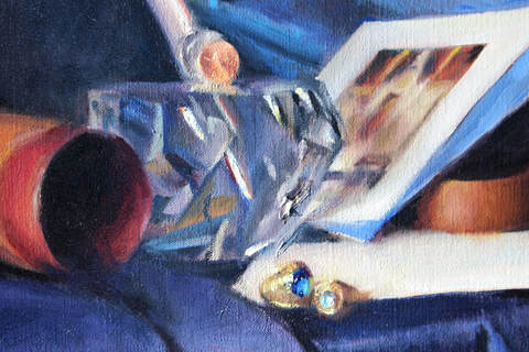 The rings are her father’s Notre Dame ring and a miniature that he had made for her mother - very important to them as a dedicated ND family! (You know I appreciated this, being class of '08, myself.) The cards are postcards which Mary and I agreed should be included in the painting. They are souvenirs from the Shrine of St. Anne in Quebec and represent the devotion Mary’s mother has to St. Anne (the mother of the Virgin Mary). Mary noted that her mother enjoys the fact that the feast of that saint falls on July 26 and that she herself also has twenty-six grandchildren. Working on this painting was an absolute delight, as Mary was an ideal patron. She was excited to share her story and to hand off the vision while also very kindly entrusting the composition and execution to me. We had a great time communicating with her throughout the process and then hearing about how the gift had gone over at Christmastime. She told us that reflecting on the painting has even been a reminder to some of the grandchildren to visit the grave of their beloved grandfather. On a technical level, it was an interesting challenge to communicate the metal and the glass in the medium of oil paint. It is my hope that this work will prove for many years to be a worthy tribute to a long and devoted marriage and the loving family it yielded. This world needs steadfast marriages and I was very glad to celebrate one this way.
Visit my Commissions page and read Mary’s kind testimonial here. Perhaps you’ve noted the two coins in the center of the painting, which were my addition (with Mary’s approval). I can tell you what their significance is, but first I’d love to know what your guess is as to their meaning -- tell me your guess in the comments below! Guest post by Deirdre M. Folley, John and I were so excited when we received an inquiry late last year from a potential patron with a vision. The email was from Jessica (name changed for privacy), who was finalizing plans for the renovation of her new home with her interior designer and needed just the right piece for the focal point of the dining room/living room area. Because the piece she had in mind was inspired by Masters like Caravaggio and de Ring, she needed someone with expertise in classical painting; and with a whole list of sacramental symbols in mind as subjects for the painting, she needed someone with an understanding of and appreciation for Christian imagery. Jessica had heard about John from a mutual friend. For an artist, there's nothing like getting a request for exactly the type of material he'd love to be doing in his own time! In a recent newsletter, respondents let us know you'd like to hear more about John's commissioned work. So here's an insider's account of the process behind this painting: 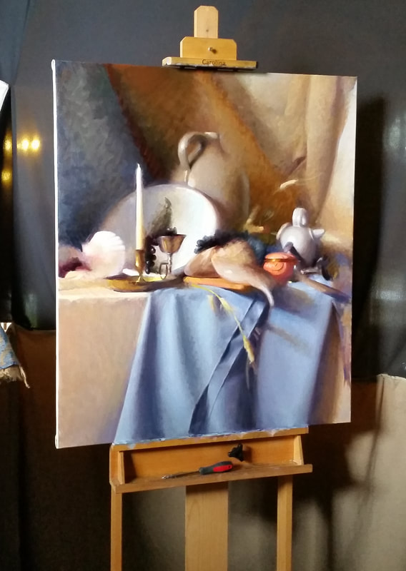 I connected with Jessica over the phone and we discussed the size, the budget for the painting, general expectations about the timing of the project, and how John's process works. She told me that she and her husband wanted a painting that would be a beautiful feature for their living space and also an image that would foster reflection and provoke conversation about the beauty of their Christian faith. Clearly, this was going to be a great fit! We agreed that he would work closely with Jessica to determine the composition and that he'd put a still life arrangement together for her approval. After a few phone calls and email exchanges, the process was underway! Early in the new year, John got to meet Jessica and her husband Tom at Tom's corporate opening event for which they hired him to do Live Painting. Soon after that, the hunt was on in earnest for just the right components of the composition. John worked closely with Jessica to hone in the objects that were going to come together to harmonize into the perfect arrangement for this still life. John took a long list of ideas (broken bread, a goblet of wine, grapes, nails, certain types of wood, a fish, coins, olives, a shell... among many other potential items) and scouted out various resources, primarily local antique stores, to find the right items. He had to balance having the particulars that were so meaningful to Jessica and her family with also gathering certain key visual elements that were going to give the composition structure and unity. Since Jessica was communicating from Florida, all of the collaboration on this happened at a distance. The two worked patiently together to come up with a final selection, which John then arranged. After discussing photos of that arrangement with Jessica and Tom, they were able to pare down to the most beautiful and essential elements. As part of John's process in laying out the still life, he completed a brown paper sketch to consider the values: 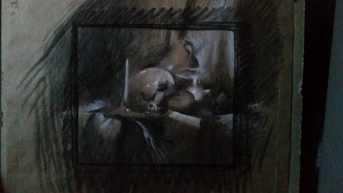 By late winter, John's patrons had moved into their new home and, with developments from the interior designer, we finalized the exact size of the painting: a grand, 33x39" masterpiece to hang in the living room. John ordered his canvas and stretchers and finally got to dig in on the actual painting process. This has been the main focus of his in-studio work for the past few months and we're finally on the home stretch of the commission. One note of interest is that the arrangement features a few food items, which had to be real to get the right visual quality. Working with real food adds an element of logistics to the careful planning of the painting. Can you identify the items and guess about the process? 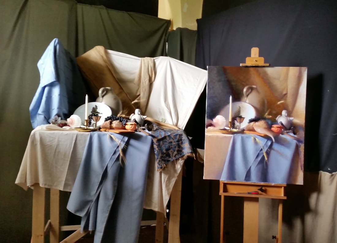 The final painting is just a matter of weeks away, and we can't wait to see it settled in Jessica & Tom's home.
We're happy to answer questions about the process, below! Stay tuned for the final product! When somebody admiring a painting of mine comes out and says "Wow, it looks just like a photo!" ...I try not to take it too personally. 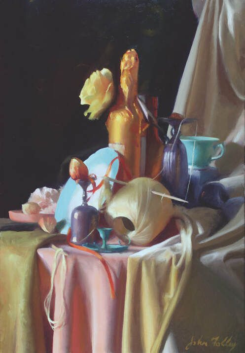 'Opal and Orange' Oil on Canvas 28 x 18. I'm always striving to include only the most important aspects of color, light, and form. 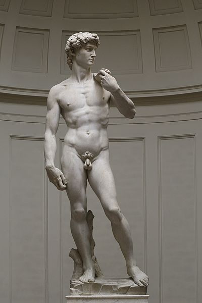 Comparing my execution of a painting with the execution of an image by a machine probably strikes them as a favorable comparison: it takes skill to get a high degree of accuracy, there must be intentionality behind the effort, the viewer likes to know what he's looking at, etc. Especially for the student who is working diligently at discipline and technique in order to achieve visual accuracy, it could be encouraging to hear that the result of one's work is "photo-accurate." It takes time and great effort to attain accuracy in one's drawing and painting. However, though most people intuitively recognize that a well-executed painting is superior to a photo, we mostly couldn't articulate how and why. For example, a wonderfully executed still life painting, hung in an ornate frame, set in a gorgeous architectural environment within, say, a formal dining room, is fitting and beautiful (if well integrated with the space). A photograph of the same subject in the same situation would seem a parody. Why? The major reason is breadth. So what is breadth, exactly? To begin answering that question, let's look to painting's near cousin, sculpture. Specifically, I ask you to compare Michelangelo's David to this wax figure from Madame Tussaud's.  Let's ask the more obvious (or at least the question more modern, empirical minds find easier to answer) first: which is more realistic? Obviously the wax sculpture, correct? Now, the less comfortable question: which is more beautiful? Don't give in to that modernist temptation to cowardice and say "who am I to judge," or "beauty is in the eye of the beholder." Don't give in to a state of agnosticism because the matter cannot be mathematically proven or quantified. Say with boldness the truth as you see it. I say just as obviously as the latter is more realistic, the former is more beautiful. But why? One important reason is the breadth of the David. I find this quote from GK Chesterton very insightful and applicable to the question at hand: "We all know the fable of the man who imitated a pig, and his rival who was hooted by the crowd because he could only produce what was (in fact) the squeak of a real pig. The crowd was perfectly right. The crowd was a crowd of very penetrating and philosophical art critics. They had come there not to hear an ordinary pig, which they could hear by poking in any ordinary pig-sty. They came to hear how the voice of a pig affects the immortal mind and spirit of a man; what sort of satire he would make of it; what sort of fun he can get out of it; what sort of exaggeration he feels to be an exaggeration of its essence, and not of its accidents. In other words, they had come to hear a squeak, but the sort of squeak which expresses what a man thinks of a pig – not the vastly inferior squeak which only expresses what a pig thinks of a man." (from Fancies Versus Fads) Michelangelo wasn't trying to recreate a literal man in marble (as a mold of a man could have been taken and enlarged for that purpose through mechanical processes) - no, he looked at men around him and, from his experience and intelligence, derived an ideal concept of a man that embodies poise, grace under pressure, beauty and form, strength and sensitivity. He communicated not only the story of David and Goliath but also the strength and beauty of the city of Florence, poised to slay her enemies. It is a higher, clear vision that grasps what is essential and leaves out what is not. It is as high above a mere cast of a man as a human being is higher than a beast. There are similar qualities but they are unmistakably different in kind and excellence. So too, with a well-executed painting and a photograph. To define it more precisely, breadth is the quality of an artwork in which the most essential elements are beautifully related one to another within the given medium without burdensome, distracting, or inessential details. Fewer facts but more grand truth and beauty. Now, where does Photorealism fit into this vision and understanding of art? Don't many artists work from photos even if they aren't Photorealists? Does this make Photorealism 'bad?' The short answer is: yes, sort of. An artist should, as much as possible, be before nature and exploring and understanding beauty as directly as possible without any mechanical separation or filter. Painting from a photograph is a fundamentally different and inferior experience and practice from painting from nature. Painting from photos is deadly to the art of painting when practiced exclusively and is deleterious to it in any quantity. This being said, it is often a necessary tool for modern artists and can be useful as long as the painter has sufficient and effective training based on direct observation of nature. Photorealism as a movement sprang up in the 20th century with much good intent. I believe many of its practitioners recognized the intimate connection between truth and beauty (which all of this previous conversation presupposes). However, photorealism has an improper relationship with the truth in a couple of ways. The first is that it accepts the photograph as a starting point and a foundation for the truth the artist bring to his art, as opposed to direct, unfiltered observation of nature. Leaning on photography this way trains the mind and eye to accept certain distortions and limitations of nature characteristic of that medium. Color, form, edge, and focus are not the same (or as beautiful) in photography as the human experience of sight. Secondly, Photorealism tends to make slavish, exact replication of a photograph with all the warts, pimples, pores, and other "facts" the end goal without the larger understanding of relationships, and most essential connections. This way of mechanically copying the already-mechanical image of a camera is the antithesis of breadth. I don't want to scold Photorealists too much though. The truth is the original Photorealists were trying to rebuild the connection to visual truth from the ruins of the destruction of Western Art. Much of their work is impressive and skillful in an age of art characterized by the rejection of truth and technique and the production of quite unimpressive, undisciplined, and/or ugly works. At the other end of the spectrum, another mistake of our time is to accept and value paintings with bad color or poor drawing - schlocky work - merely because it is "art" that is too poorly made to even appear to be based on a photograph. In essence: valuing deformity as opposed to breadth and beauty. Both of these errors (of Photorealism and schlocky painting) are types of Neo-primitive ways of painting and inferior to the great tradition of Western Art. I want to close with two paintings from the Museum of Fine Arts, Boston (MFA) that struck me on a recent tour I gave - one by Chardin and one by a Flemish Master, Frans Snyders. The difference I will describe is what led the Boston School painters (who founded the MFA) to revere Chardin as a hero and to appreciate Snyder as striving towards greatness yet ultimately remaining relatively primitive. Among other interesting objects, this still life by Snyders features a pedestal of grapes. Every grape is thoroughly and painstakingly described, the decoration on the fine china is there in all of its detail, the weave of the wicker basket is accurate, and so on. It is realistic. It is detailed. It is impressive. 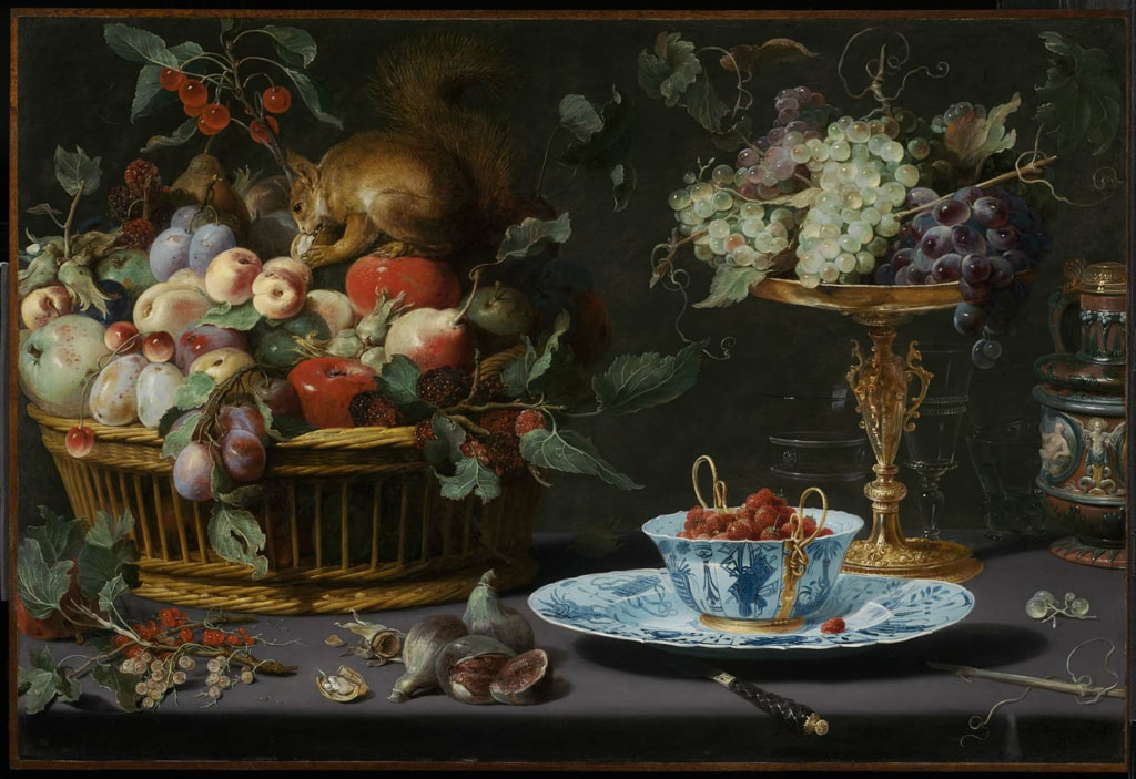 Still Life with Fruit, Wan-Li Porcelain, and Squirrel. Frans Snyders (Flemish, 1579–1657), 1616. Image courtesy of the MFA (www.mfa.org). The other is a small still life by Chardin that might easily be overlooked despite its significant placement on one of the two main columns in the front of the museum (another still life by the same painter occupies the other column as well). In this simpler composition we find many fewer edges and details. The grapes, when inspected closely, tend to blend in with each other. However, as the viewer steps back, one or two edges of the cluster of grapes jump out - a reflection here, a silhouette there - until the viewer perceives some as being closer, others receding into the shadows (to recreate the effect, try squinting at your screen a bit). As the viewer backs even further, the grapes interact with the ceramic around it and the table underneath until, unmistakably, a scene of light and forms with clear and unmistakable depth congeals in front of the viewer's gaze... each part related to every other. 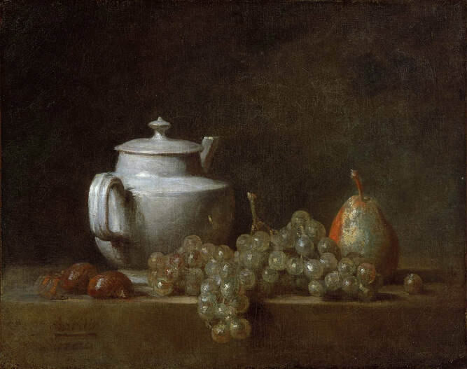 Still Life with Teapot, Grapes, Chestnuts, and a Pear. Jean Siméon Chardin (French, 1699–1779) 17[64?]. Image courtesy of the MFA (www.mfa.org) With this fresh experience of the painting, one glances back at the first work and notices how, despite all of its detail, it looks flat. One grape in front looks almost as close as the grape in the back of the cluster. One intricately detailed edge of the plate seems just as close as the other despite sitting on a flat table and being, presumably, almost a foot away. A direction of light is indicated but not felt. The Snyders has intricate detail added to intricate detail (1 + 2 + 3 + 4... ). On the other hand, the Chardin has considerably fewer details... but each chosen one is in marvelous harmony with the others. These details communicate with one another and multiply their respective effects into a grand unity, more expansive and much more meaningful than any single part by itself (1 x 2 x 3 x 4...). The former has intricacy but the latter has - you guessed it - breadth. |
AuthorHello there, I'm John H. Folley, an oil painter in the Boston School tradition. Thanks for visiting the Beauty Advocacy Blog, where it's my job to help you become a more discerning art appreciator. 
Connect with John:
Categories
All
Archives
February 2024
|