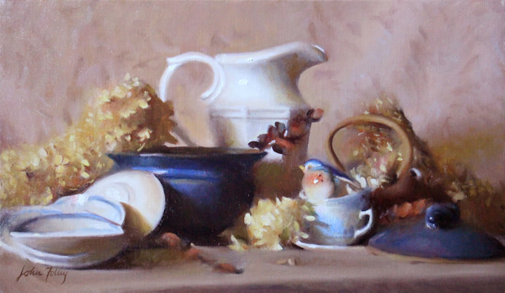
 'Chesternest' Oil on canvas. 14" x 24" Chesternest is named after the apartment home where my wife Deirdre and I grew our family from one child to three. We called our apartment 'The Chesternest' because of its location in Manchester, NH as well as the fact that Deirdre was in 'nesting' mode when we moved in, as we were expecting our second child. Being on the second floor of a three-family home, we felt "nestled" into our spot above a street where we came to make many friends and share a beautiful season of our life. That home, which we left this past spring, was filled with happy memories including the more than three years of my drawing and painting training under Paul Ingbretson, many hours spent playing with our little ones, and hours of friendship and parties with other families from the neighborhood. It was our cozy nook for a young family in a small city. I hope this painting communicates some of that feeling. Among the elegant ceramics and delicate dried hydrangea blossoms, a small porcelain bluebird is making its nest inside a stacked teacup. The blue and red-browns and yellows that predominate this painting have an air of calm and quiet about them. They are subtle rather than loud. There is a sense of stillness and perhaps even distance about this still life that I hope will remind the viewer of the peace of a home. The blue china cups and plates that are stacked and scattered throughout the painting are actually from the set of dishes we used as a family on a daily basis for our meals, and are artifacts weighed down with the memories and happiness of those days for me. Information for collectors: Please see further details about Chesternest on the Still Life page.
3 Comments
In a previous post, I said that still life offers all of the best that the art of painting has to offer - not only the object painted, but what it does, visually. Falling in love with the visual. The next step (and a harder step) in understanding painting is to understand what objects are doing together. This is something that has dawned upon me gradually (and I am sure that my understanding is still incomplete).  One particular way that I have come to know the harmony of different objects working together is the concept of a color scheme. So what is a color scheme? In college I learned one step more than I leaned in 3rd grade. In grade school I heard about complimentary colors: red and green, blue and orange, purple and yellow... these colors are "complementary colors." Later on in college someone presented the idea that pictures should have "complementary color schemes." What this boiled down to was: pick a "red" and a "green" and build up a picture using them; this will give your picture a unity and good contrasts and will make it look more like it has a "color scheme." For me this presentation of the idea was anything but compelling. I believe in large part it was so because the ideas were poorly communicated -- but I also suspect that those teaching me had, in fact, a very shallow understanding of them as well. I suspect some of the teachers didn't really "believe in" or rather understand that color has certain rules and laws to be discovered. Even among many trained painters it is common to say things like "color is entirely relative" or "color is just such a personal thing." In my years of study with Paul I discovered that this simply is not the case. A large part of discovering the truth about color is jettisoning a lot of partial, formulaic knowledge about "color scheme" and what it means to be a "complementary color." I had just to observe what two colors do together. This exercise can be a very hard and trying thing. Looking for something, trying to observe something about the relationship between two colors that, initially, you can barely imagine. Paul encouraged me to find two colors that "looked magical" together. What did that even mean? They had to look better together than when they were apart. If a certain red looked good with a certain blue Paul would ask "did you try EVERY red with that blue?" This was very challenging: had I really seen every red with this blue? Was there a better one? And often the answer was "yes, there was a better one." Over time, my judgment and perceptions became sharper and sharper and before long, by trial and error of learning to see color relationships, I got to the point where I knew when colors were magical together. This is one aspect of the harmony that drives mature artists to make still life. There are many others that exist: shape harmony, value rhythms, lost and found, the play of main lines, gesture and movement, transitions, and many more. These larger unities comprise the "game" of visual harmony and are what bring artists back to picture making again and again. Watching for them and understanding them will make you a more discerning art appreciator and will open up a world in which you can delight in still life. 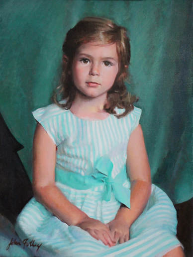 One of my very favorite New England faces: my daughter, Evangeline. I am pleased to announce the launch of my current project: a series of paintings and general focus of my work surrounding the theme of The Faces of New England. No doubt you immediately think of human faces -- and so do I. I am available to take on portrait commissions and will be excited to have local patrons who want to be part of this project and who want their faces to represent the beautiful states of Maine, New Hampshire, Vermont, Massachusetts, Rhode Island, and Connecticut. There is no one face that encapsulates the character of this region. I myself will be scouting out subjects that I think embody some aspect of New England and what it means to me. The possibilities here are vast and fascinate me! What are the New England "types?" Are there some folks who may not immediately come to mind, but who deserve to be included? Who do you believe represents New England? I will also be seeking out the Face of New England in the landscape and architecture of the area. Those spots that give us our character; sights and buildings that make New England memorable; places that people come from elsewhere to see -- or perhaps would, if they knew about them! Finally, this theme will make its way into my still life work within the studio. I'll be looking to include objects and products unique to New England within my still life paintings. I'm excited to find inspiration in the things that are around us that we perhaps take for granted: natural objects, artisan products, New England furniture, etc. Keep this in mind for a custom still life request: you might have something that's near and dear to you that you'd like incorporated - and frozen in time - in a still life painting. And, if so, I'd love to hear the story behind it!  Plein air sketch in Portsmouth, NH As we know, Boston is the most prominent city in this region. I'm very proud to be taking my traditional, Boston School training and applying it this way to look all around the region and develop a series that will be meaningful to everyone who cares about this part of the country. What are your favorite places in New England? Do you know someone who somehow embodies the the region or one of the states, specifically? What are the hidden treasures of this beautiful area that are waiting to be preserved in art? I'd love to hear! I'll have more to say about this project as it develops! #facesofnewengland 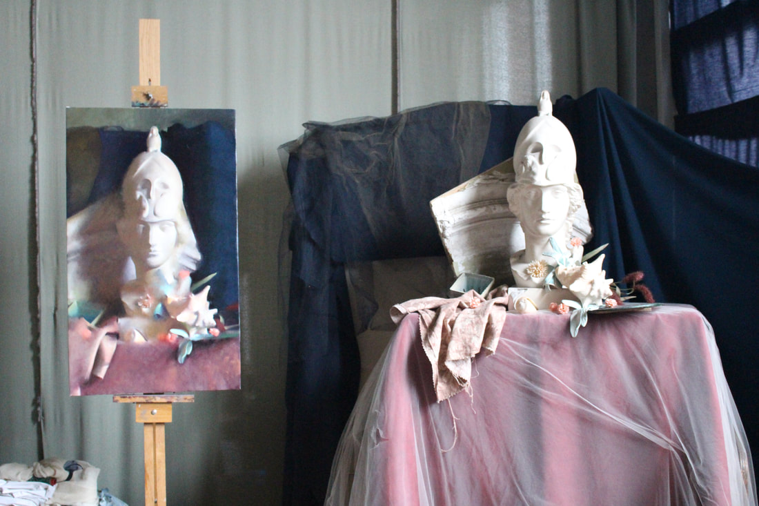 'Athena' (32"x20") in progress When I think about general reactions to still life, I remember a good number of people, including my past self, saying, "Still life is boring."
To be fair, even still, I have to agree that many still life paintings are. So why should you as a viewer and we as a culture enjoy still life? Because still life offers a brilliant opportunity to enjoy all of the best things that painting can offer: color, light and form, harmonious composition, chiaroscuro (lost and found), the poetry of omission, and even the close study of detail. In a word, the best still life offers beauty. The common viewer might then reply: "What is so beautiful about making a pot or a gourd or some dishes in paint? Often people paint very ugly pots, gourds, and dishes, even if in many ways they look realistic." What often is not understood about the art of still life painting is that the best artists aren't necessarily interested in the objects per se. The amateur artist is really excited when he accomplishes a reasonable likeness of a pot, and rightfully so; we all have to start somewhere. However the more mature artist is interested in what the pot is doing that makes it beautiful. Even more importantly, the mature artist is interested in what the pot is doing with and to everything else in the picture. The mature artist is interested in the particular beauty and harmony made by the objects even more than the objects themselves. From an artistic point of view, some of the things that an object can "do" that make it beautiful include rolling its form, shimmering in light, "singing" certain color notes, or sweeping a particularly lovely contour line. The artist wonders at and falls in love with these attributes and is not happy until he has captured them in his painting (and seldom is he happy even then!). A particular point in my life stands out to me when I noticed for the first time, in what I would call an artistic way, what an object was doing. I distinctly recall, back in 3rd or 4th grade, setting up a still life at home, all by myself. The reason that I did, I remember clearly: I had recently read and more importantly seen the illustrations from the Old Bear/ Brown Bear by Jane Hissey - and had been deeply struck and even in awe of how ROUNDED the stuffed animals were! What a marvelous thing! How could a flat page take on three dimensional form like that? I had to find out. I had to get that wonderful, beautiful thing in my own drawing. So I set up four or five of my siblings' stuffed animals and got a large, yellowed, mostly unwrinkled piece of packing paper and a pencil and started drawing. And I got a little piece of what I was looking for. Since that day I have found many other things that objects "do" that I have fallen in love with: how an object glows with light; when it hits a pure, clear color note; when it disappears; when its edge projects with a magical silhouette. Every one of these things and much more can be found in still life. So next time you see a still life, try to look past the vase of flowers or the teapot and see what those objects are doing and you might just find something you love. |
AuthorHello there, I'm John H. Folley, an oil painter in the Boston School tradition. Thanks for visiting the Beauty Advocacy Blog, where it's my job to help you become a more discerning art appreciator. 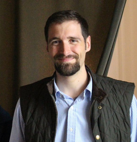
Connect with John:
Categories
All
Archives
February 2024
|