|
Roger Kimball's book The Rape of the Masters: How Political Correctness Sabotages Art was a fun, quick read from cover to cover. If you have ever been subjected to recent art criticism, this book provides catharsis. With humor and wit, Kimball confronts the obfuscating rhetoric that clothes political agendas -- not with his own competing rhetoric and agenda but by trying to let the artwork speak for itself. Whereas so-called art critics, bedecked as they are with prestige, institutional backing, and economic privilege, tend to flabbergast, intimidate, and discourage, Kimball encourages his readers to take a step back, have a good laugh at what currently passes for academic art insight, and counter it with a good dose of common sense. He often quotes artists themselves, as well as their contemporaries, to provide a clearer view of how they understood each artwork under discussion. 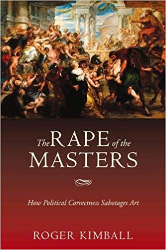 Kimball considers a number of cases of art criticism that he assures us are representative of the current practices in the field (rather than outliers or exceptions), systematically exposing them and de-jargonizing them while diagnosing the intellectual diseases at work in each case. Having been through a number of college art history courses at a prestigious university, I can attest that his selection of texts certainly is representative of the fare foisted upon my classmates and I. One of my favorite instances here is a perfectly ridiculous text on "The Daughters of Edward Darley Boit," a beautiful group portrait by John Singer Sargent. The art historian who penned the text, one Professor Lubin, wanders so far afield that he starts reading perverse sexual meaning into words that don't even appear in the painting or in the title of the painting, but only in the pun on the title that the author admits to fabricating himself and that would have never occurred to the artist or the patron. It is in this bizarre way that he purports to "find" the meaning inherent in the artwork. From the book: "Professor Lubin's first point is that the French word for box, boîte, is only one letter and an accent mark away from the surname of the painting's subject: "Boit." "The Boit Children makes a visual-verbal pun by translating into Les Enfants de (la)Boît(e): the children of Boit and the children of the box." In fact, it is not the painting that makes the pun - and a silly enough pun it is - but Professor Lubin. And that's just the beginning of the charade.... "Professor Lubin readily admits that "It far oversteps the bounds of credibility to think that Sargent had any of this in mind before, during, or after he painted the painting." "For this relief, much thanks"! (Hamlet I:1) But then he cheerfully tells us that, notwithstanding what Sargent thought, we shouldn't be surprised "if somehow a psychic transfer or transmutation occurs between the verbal part of the creative mind... and the visual part." Psychic transfer? Transmutation? What is this, Shirley MacLaine meets art history?" Kimball quotes Lubin at length as the latter goes on (and on) about vagaries of the significant connections between certain - ahem - anatomical parts and the uppercase and lowercase of the letter 'e' (because -- don't forget! -- the letter 'e' is conspicuously absent from the name in the title of this painting! Following this?). All he has to do here to reveal Lubin's absurdity to the sound-minded is simply to quote him! In short, Kimball has done a wonderful service: He selects representative tests of art criticism, translates them for his reader in the context of the real work, the practices of the artist, and his times, and calls them out for what they are: self-serving academic and political garble dressed up in very fancy pseudo-psychology, pseudo-philosopy, and, most of all, just words, words, words... Words that ultimately obscure the paintings they purport to describe. Kimball continues on more witty and enlightening jaunts with paintings by Courbet, Rubens, Winslow Homer, and van Gough and their critical aggressors, valiantly defending the honor of the masters along the way. 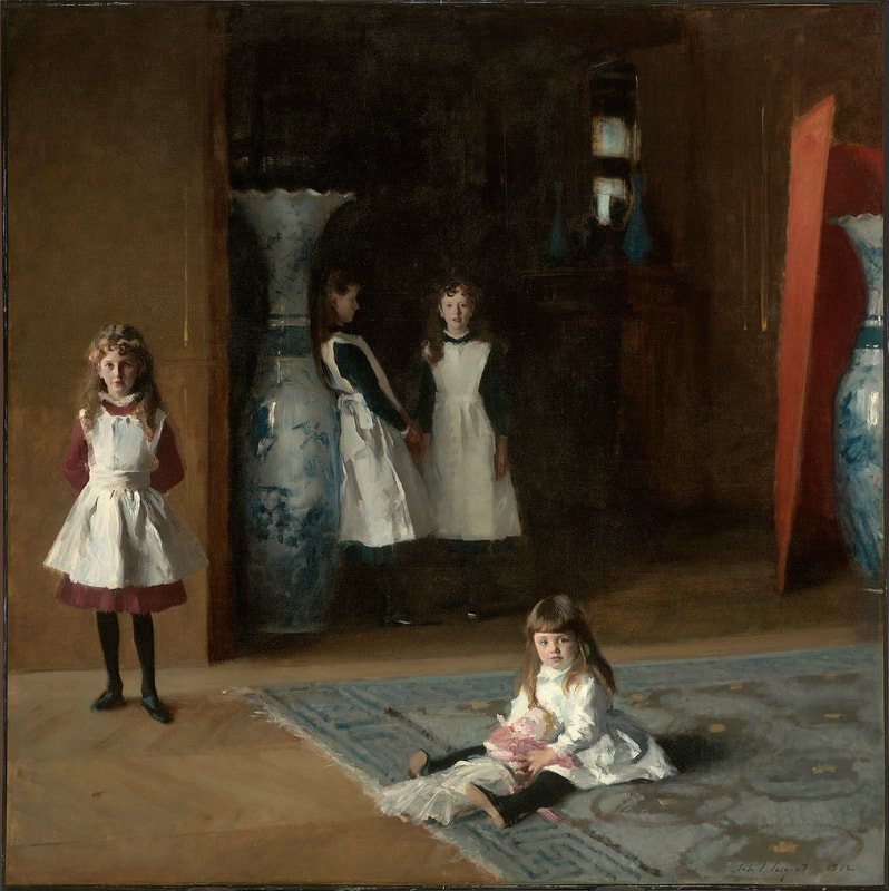 Sargent's group portrait. Photo courtesy of www.MFA.org While he does a delightful job of pointing out the ridiculous aspects of the current state of art criticism and the intellectual rot that has for a long time posed as learning, I do dock Kimball a few points for trying to enlist to his aid a number of artists and critics who are complicit in this decay. For example, Kimball amusingly rips apart a piece of art criticism or two dealing with the canvases of Marc Rothko, but not before a few pages of dedicated to apparently serious appreciation of that painter. He seems to accept, if not validate, Rothko's place in the canon of Western Art as written by the very critics and academics he is lampooning. Rothko's current prestige and place in the art world relies almost solely on the basis of the ridiculous climate of the arts made possible by the decay of common sense and the love of beauty. The only way Rothko can be so highly revered as he currently stands is through the rejection of beauty and the acceptance in its place of fatuous theory and political jockeying.
Kimball also tries to enlist Clement Greenberg as an ally in his interpretation of Paul Gauguin without putting Greenberg in his proper context as one of the primary founders of the strains of art history attempting to do away with beauty as a central theme in understanding art. In fact, Greenberg himself was one of the first critics to reject the beautiful representation of volumetric form in paintings as meritorious and in its stead have a theory of art that valued "flatness" per se. This of course flies in the face of the tradition of Western painting which, from the time of Leonardo and even before, considered the beautiful and accurate rendering of three dimensional form one of the key marks of beauty and indicators of the accomplishment of an artist. For readers interested in the subject of art history and those looking for further entertainment along these lines, I recommend Tom Wolf's The Painted Word to understand the earlier stages of the sickness of the art world and gain a broader critique of certain facts that Kimball either takes for granted or doesn't recognize as part of the problem. Overall The Rape of the Masters proves clarifying, fun, and refreshing. I would heartily recommend it to anyone, especially those who deal with art critics or interact with the art world establishment in any way. From the author himself: "... I hope that The Rape of the Masters will provide some inoculation against academic intimidation. The claims made by the critical marauders I discuss in this book are so outlandish, and they are typically expressed in language that is so rebarbative, that many people are stunned into acquiescence or at least into silence. It pleases me to think that The Rape of the Masters will help counteract that anesthesia, prompting more people to object to the objectionable." I think that Kimball's book will bear out these hopes admirably. Students in particular, approaching the discussion of art within mainstream academia or other art criticism circles, will do well to arm themselves with this work before undergoing the mental assault typical of the field. I wish I had been thus armed myself. What do you think? Does art criticism intimidate you? Do you have a hard time with interpretations of paintings that seem to be irrelevant to what's actually on the canvas?
2 Comments
When somebody admiring a painting of mine comes out and says "Wow, it looks just like a photo!" ...I try not to take it too personally. 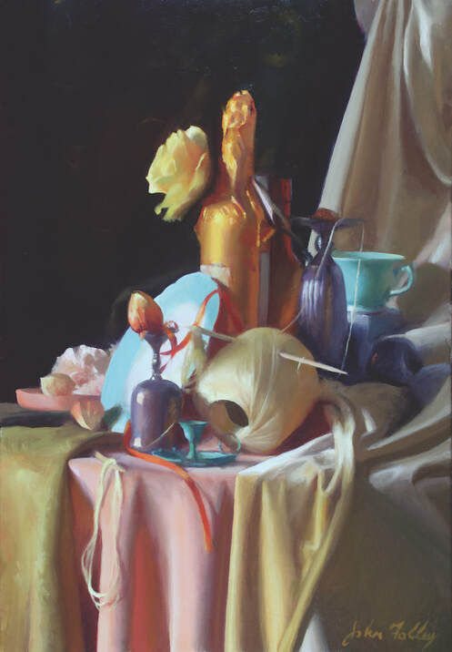 'Opal and Orange' Oil on Canvas 28 x 18. I'm always striving to include only the most important aspects of color, light, and form. 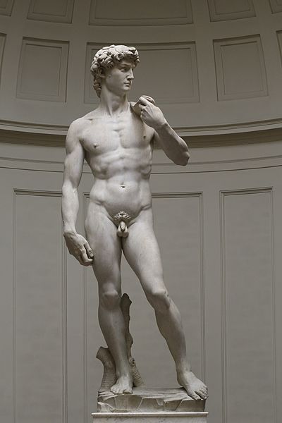 Comparing my execution of a painting with the execution of an image by a machine probably strikes them as a favorable comparison: it takes skill to get a high degree of accuracy, there must be intentionality behind the effort, the viewer likes to know what he's looking at, etc. Especially for the student who is working diligently at discipline and technique in order to achieve visual accuracy, it could be encouraging to hear that the result of one's work is "photo-accurate." It takes time and great effort to attain accuracy in one's drawing and painting. However, though most people intuitively recognize that a well-executed painting is superior to a photo, we mostly couldn't articulate how and why. For example, a wonderfully executed still life painting, hung in an ornate frame, set in a gorgeous architectural environment within, say, a formal dining room, is fitting and beautiful (if well integrated with the space). A photograph of the same subject in the same situation would seem a parody. Why? The major reason is breadth. So what is breadth, exactly? To begin answering that question, let's look to painting's near cousin, sculpture. Specifically, I ask you to compare Michelangelo's David to this wax figure from Madame Tussaud's.  Let's ask the more obvious (or at least the question more modern, empirical minds find easier to answer) first: which is more realistic? Obviously the wax sculpture, correct? Now, the less comfortable question: which is more beautiful? Don't give in to that modernist temptation to cowardice and say "who am I to judge," or "beauty is in the eye of the beholder." Don't give in to a state of agnosticism because the matter cannot be mathematically proven or quantified. Say with boldness the truth as you see it. I say just as obviously as the latter is more realistic, the former is more beautiful. But why? One important reason is the breadth of the David. I find this quote from GK Chesterton very insightful and applicable to the question at hand: "We all know the fable of the man who imitated a pig, and his rival who was hooted by the crowd because he could only produce what was (in fact) the squeak of a real pig. The crowd was perfectly right. The crowd was a crowd of very penetrating and philosophical art critics. They had come there not to hear an ordinary pig, which they could hear by poking in any ordinary pig-sty. They came to hear how the voice of a pig affects the immortal mind and spirit of a man; what sort of satire he would make of it; what sort of fun he can get out of it; what sort of exaggeration he feels to be an exaggeration of its essence, and not of its accidents. In other words, they had come to hear a squeak, but the sort of squeak which expresses what a man thinks of a pig – not the vastly inferior squeak which only expresses what a pig thinks of a man." (from Fancies Versus Fads) Michelangelo wasn't trying to recreate a literal man in marble (as a mold of a man could have been taken and enlarged for that purpose through mechanical processes) - no, he looked at men around him and, from his experience and intelligence, derived an ideal concept of a man that embodies poise, grace under pressure, beauty and form, strength and sensitivity. He communicated not only the story of David and Goliath but also the strength and beauty of the city of Florence, poised to slay her enemies. It is a higher, clear vision that grasps what is essential and leaves out what is not. It is as high above a mere cast of a man as a human being is higher than a beast. There are similar qualities but they are unmistakably different in kind and excellence. So too, with a well-executed painting and a photograph. To define it more precisely, breadth is the quality of an artwork in which the most essential elements are beautifully related one to another within the given medium without burdensome, distracting, or inessential details. Fewer facts but more grand truth and beauty. Now, where does Photorealism fit into this vision and understanding of art? Don't many artists work from photos even if they aren't Photorealists? Does this make Photorealism 'bad?' The short answer is: yes, sort of. An artist should, as much as possible, be before nature and exploring and understanding beauty as directly as possible without any mechanical separation or filter. Painting from a photograph is a fundamentally different and inferior experience and practice from painting from nature. Painting from photos is deadly to the art of painting when practiced exclusively and is deleterious to it in any quantity. This being said, it is often a necessary tool for modern artists and can be useful as long as the painter has sufficient and effective training based on direct observation of nature. Photorealism as a movement sprang up in the 20th century with much good intent. I believe many of its practitioners recognized the intimate connection between truth and beauty (which all of this previous conversation presupposes). However, photorealism has an improper relationship with the truth in a couple of ways. The first is that it accepts the photograph as a starting point and a foundation for the truth the artist bring to his art, as opposed to direct, unfiltered observation of nature. Leaning on photography this way trains the mind and eye to accept certain distortions and limitations of nature characteristic of that medium. Color, form, edge, and focus are not the same (or as beautiful) in photography as the human experience of sight. Secondly, Photorealism tends to make slavish, exact replication of a photograph with all the warts, pimples, pores, and other "facts" the end goal without the larger understanding of relationships, and most essential connections. This way of mechanically copying the already-mechanical image of a camera is the antithesis of breadth. I don't want to scold Photorealists too much though. The truth is the original Photorealists were trying to rebuild the connection to visual truth from the ruins of the destruction of Western Art. Much of their work is impressive and skillful in an age of art characterized by the rejection of truth and technique and the production of quite unimpressive, undisciplined, and/or ugly works. At the other end of the spectrum, another mistake of our time is to accept and value paintings with bad color or poor drawing - schlocky work - merely because it is "art" that is too poorly made to even appear to be based on a photograph. In essence: valuing deformity as opposed to breadth and beauty. Both of these errors (of Photorealism and schlocky painting) are types of Neo-primitive ways of painting and inferior to the great tradition of Western Art. I want to close with two paintings from the Museum of Fine Arts, Boston (MFA) that struck me on a recent tour I gave - one by Chardin and one by a Flemish Master, Frans Snyders. The difference I will describe is what led the Boston School painters (who founded the MFA) to revere Chardin as a hero and to appreciate Snyder as striving towards greatness yet ultimately remaining relatively primitive. Among other interesting objects, this still life by Snyders features a pedestal of grapes. Every grape is thoroughly and painstakingly described, the decoration on the fine china is there in all of its detail, the weave of the wicker basket is accurate, and so on. It is realistic. It is detailed. It is impressive. 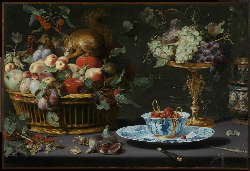 Still Life with Fruit, Wan-Li Porcelain, and Squirrel. Frans Snyders (Flemish, 1579–1657), 1616. Image courtesy of the MFA (www.mfa.org). The other is a small still life by Chardin that might easily be overlooked despite its significant placement on one of the two main columns in the front of the museum (another still life by the same painter occupies the other column as well). In this simpler composition we find many fewer edges and details. The grapes, when inspected closely, tend to blend in with each other. However, as the viewer steps back, one or two edges of the cluster of grapes jump out - a reflection here, a silhouette there - until the viewer perceives some as being closer, others receding into the shadows (to recreate the effect, try squinting at your screen a bit). As the viewer backs even further, the grapes interact with the ceramic around it and the table underneath until, unmistakably, a scene of light and forms with clear and unmistakable depth congeals in front of the viewer's gaze... each part related to every other. 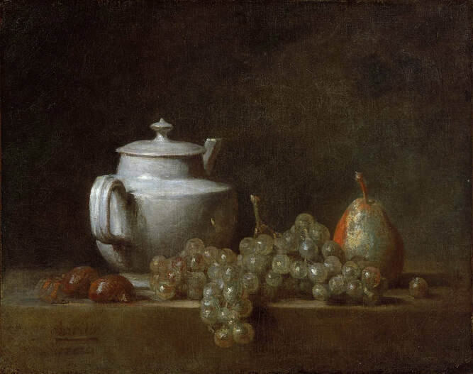 Still Life with Teapot, Grapes, Chestnuts, and a Pear. Jean Siméon Chardin (French, 1699–1779) 17[64?]. Image courtesy of the MFA (www.mfa.org) With this fresh experience of the painting, one glances back at the first work and notices how, despite all of its detail, it looks flat. One grape in front looks almost as close as the grape in the back of the cluster. One intricately detailed edge of the plate seems just as close as the other despite sitting on a flat table and being, presumably, almost a foot away. A direction of light is indicated but not felt. The Snyders has intricate detail added to intricate detail (1 + 2 + 3 + 4... ). On the other hand, the Chardin has considerably fewer details... but each chosen one is in marvelous harmony with the others. These details communicate with one another and multiply their respective effects into a grand unity, more expansive and much more meaningful than any single part by itself (1 x 2 x 3 x 4...). The former has intricacy but the latter has - you guessed it - breadth. |
AuthorHello there, I'm John H. Folley, an oil painter in the Boston School tradition. Thanks for visiting the Beauty Advocacy Blog, where it's my job to help you become a more discerning art appreciator. 
Connect with John:
Categories
All
Archives
February 2024
|